Hildegard Braukmann
Corporate Design
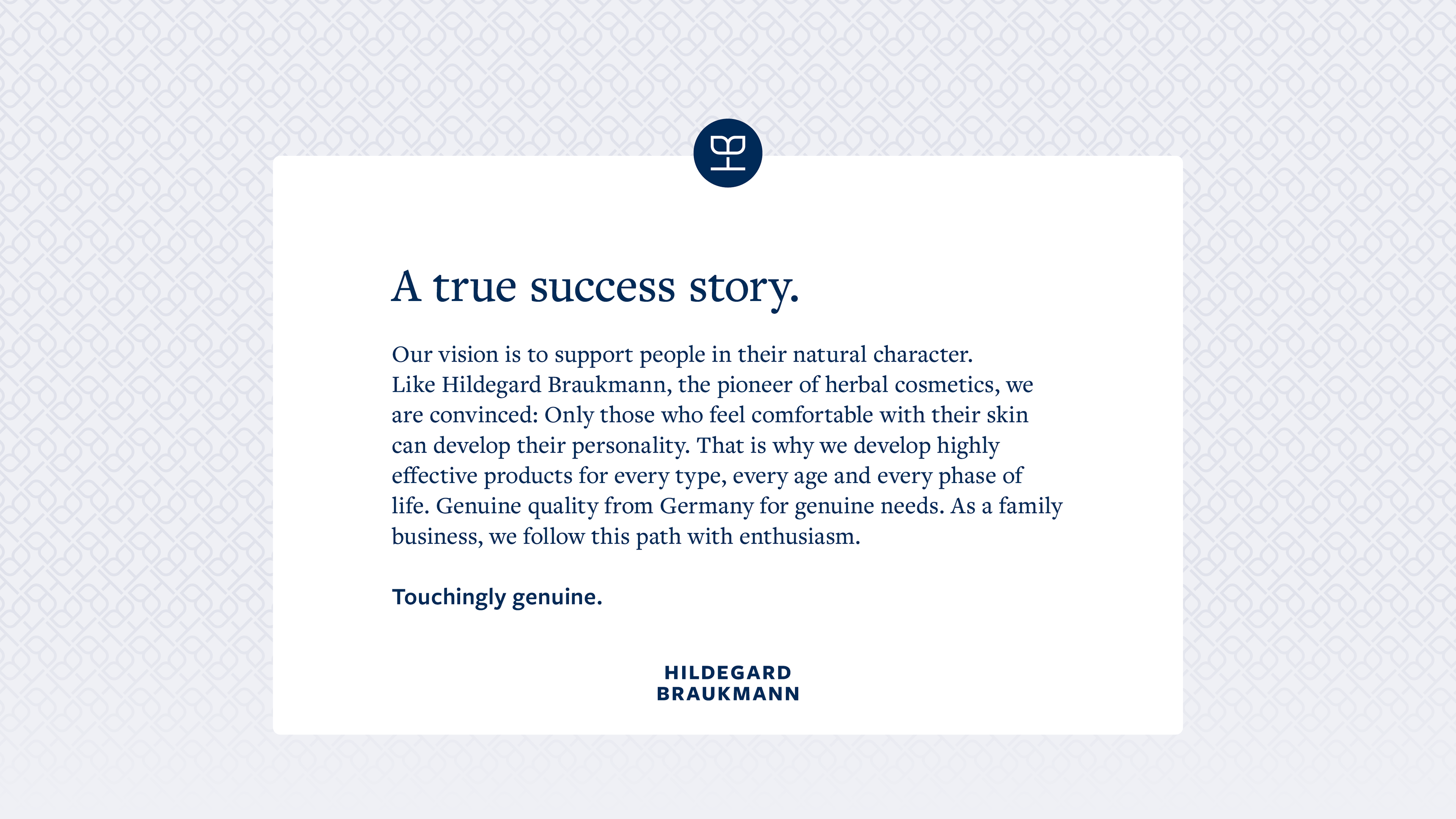
The family business HILDEGARD BRAUKMANN is deeply rooted in the herbal cosmetics movement of the 1960s and today researches new recipes that support people in all their natural characteristics. A true success story, which so far has hardly been felt through its design. This has also been shown by market research commissioned by the company. Customers, partners and employees missed in its appearance what they appreciated so much about the innovative family business.
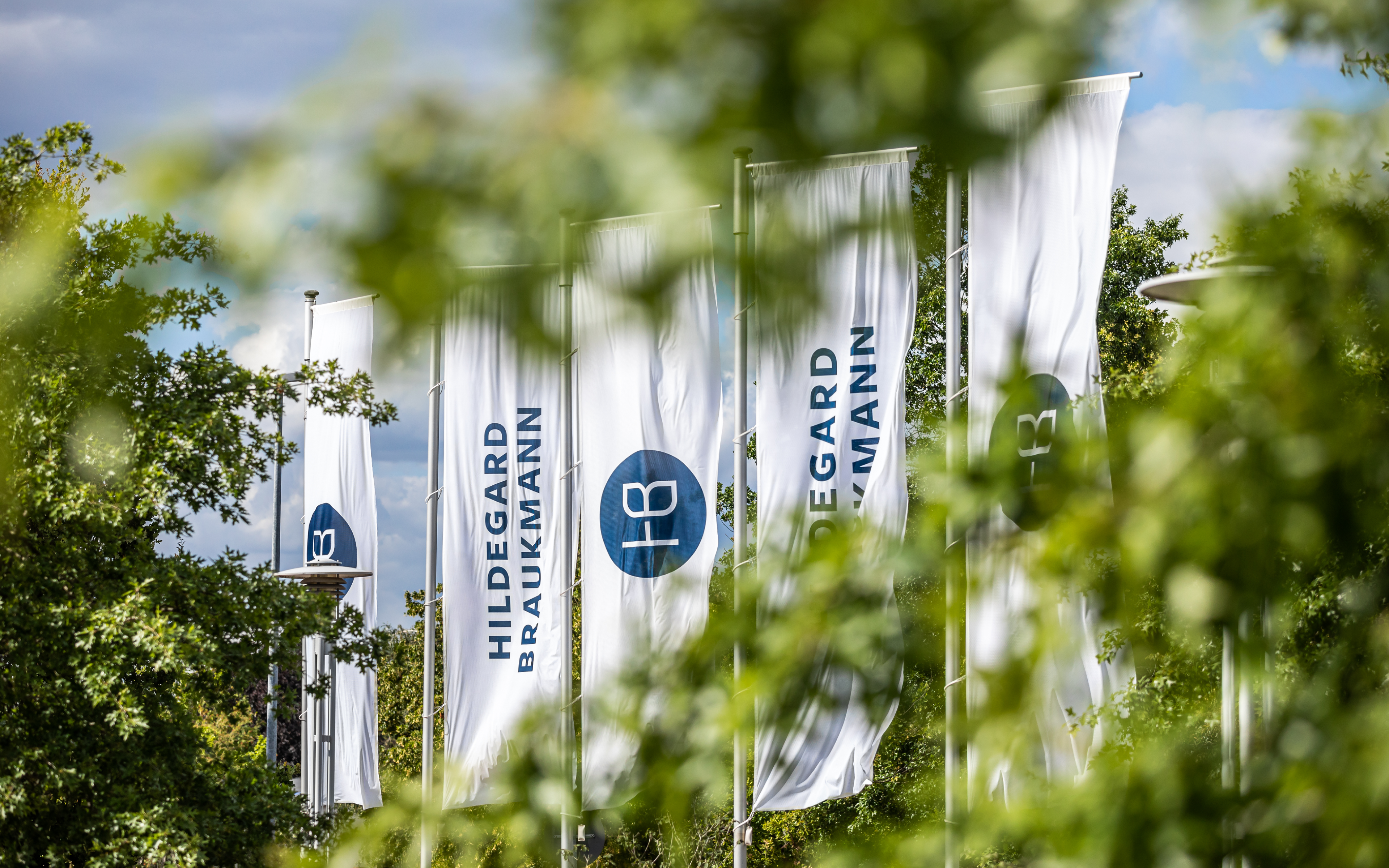
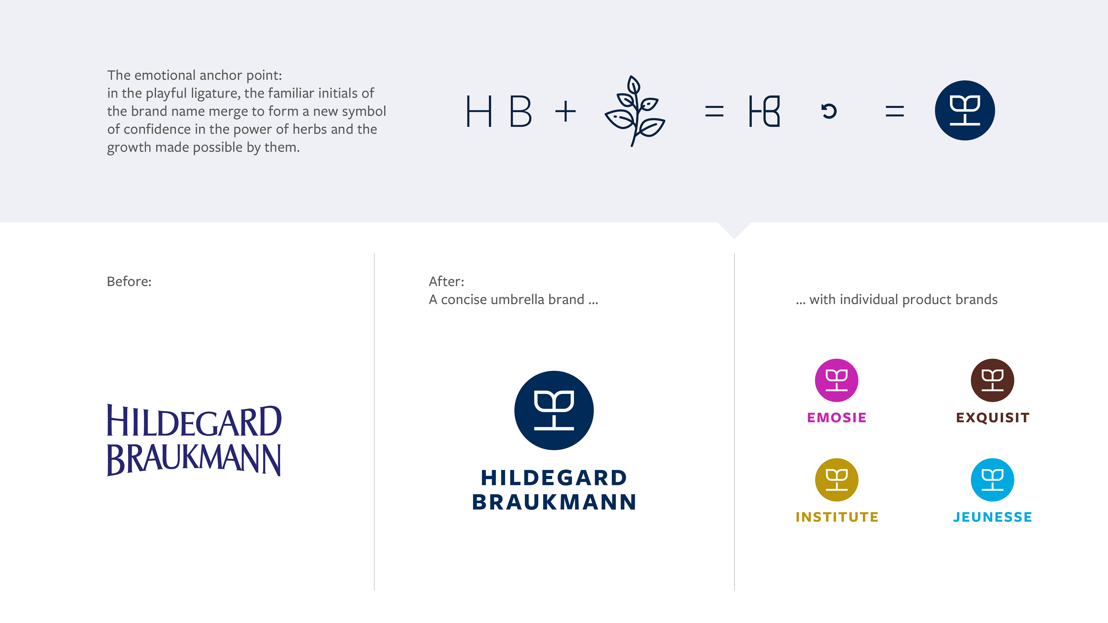
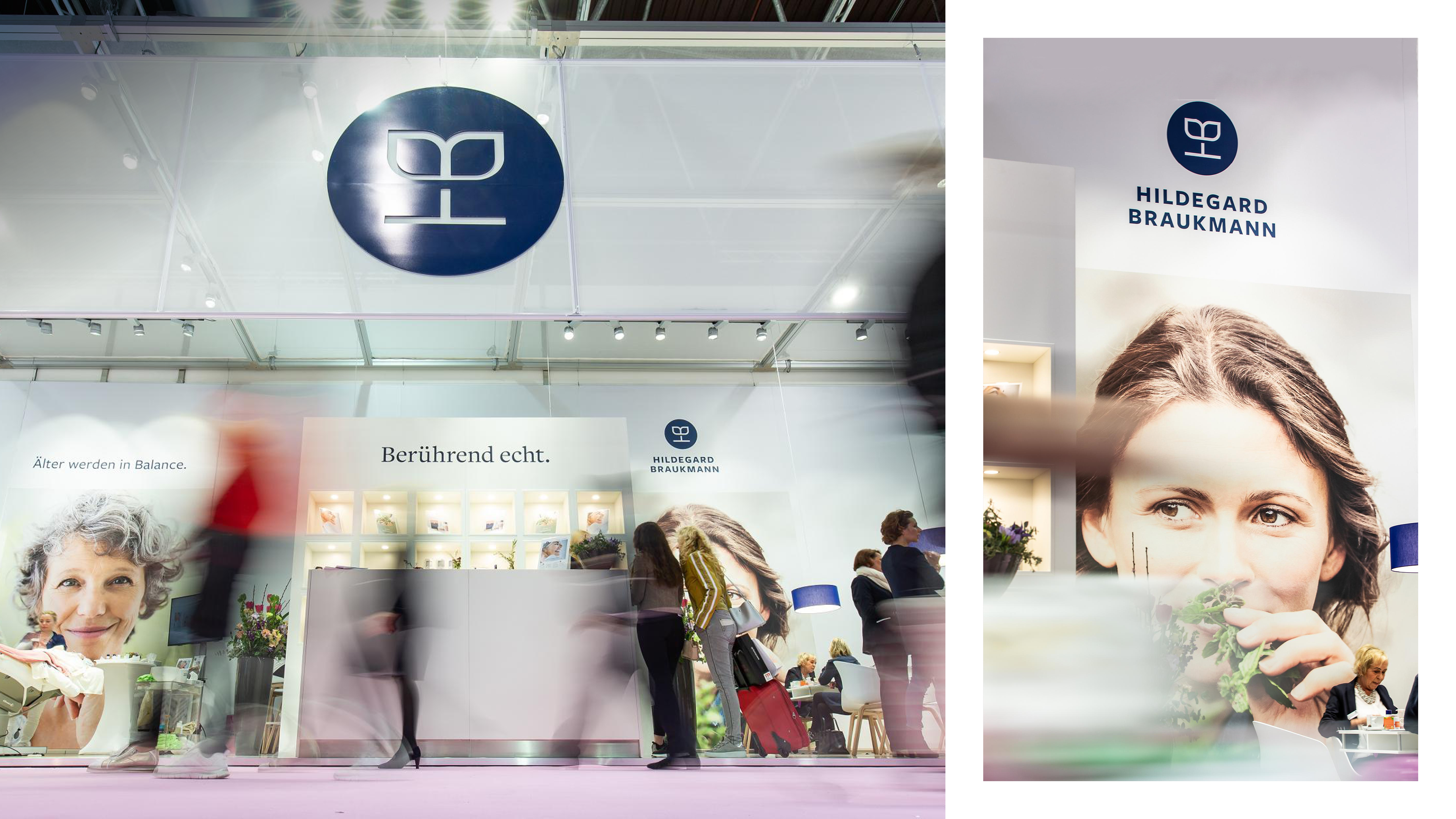
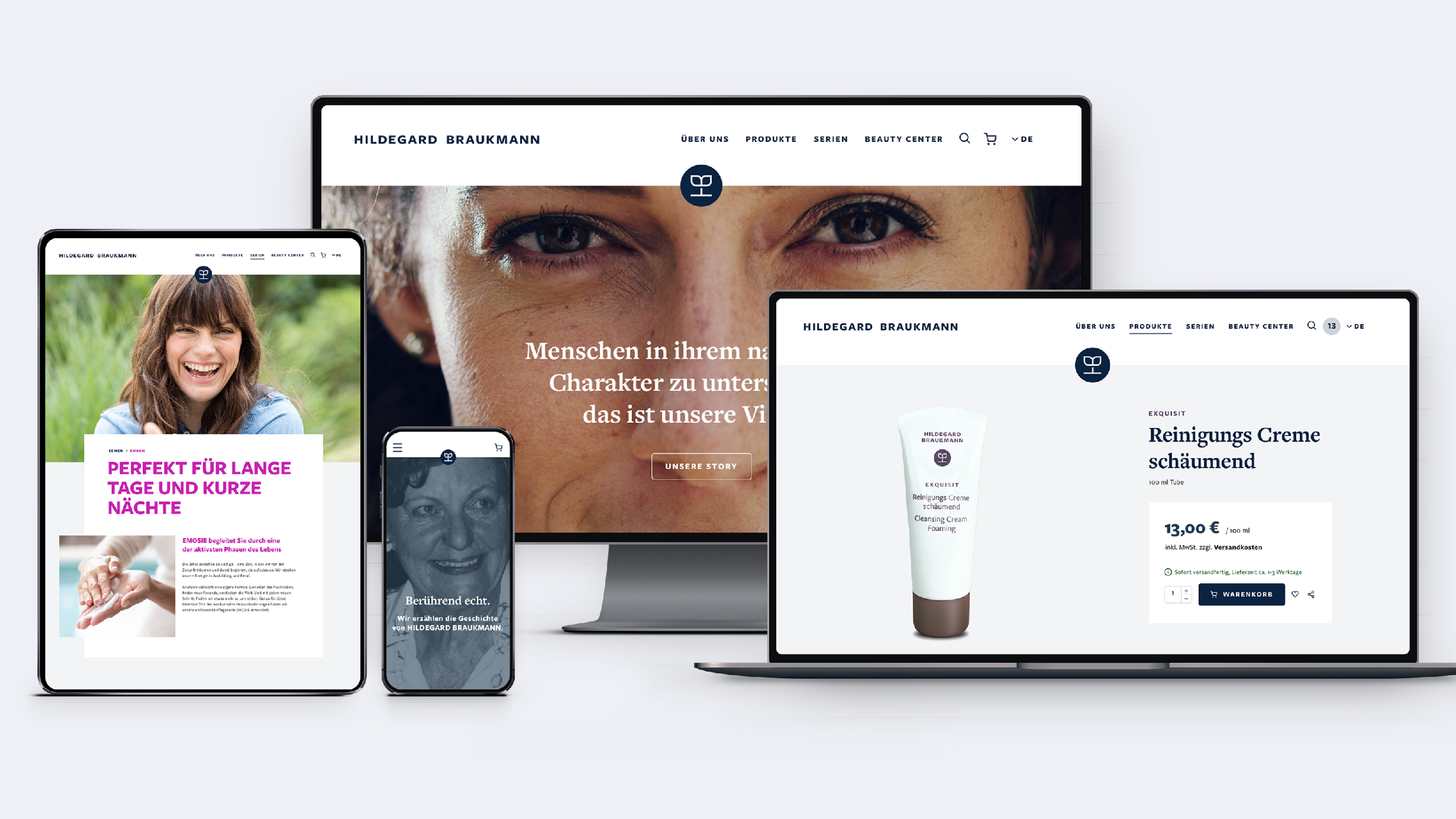
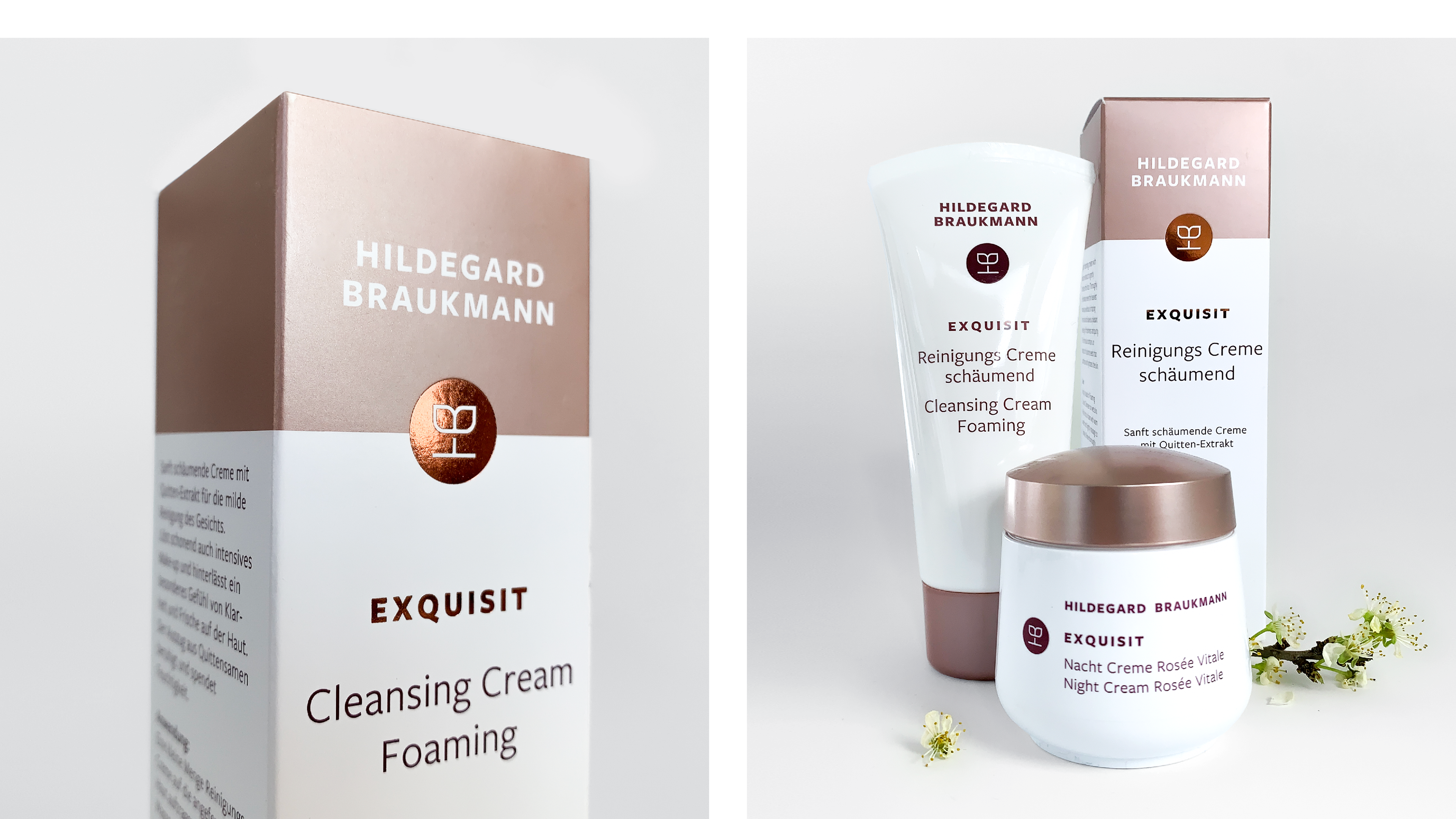
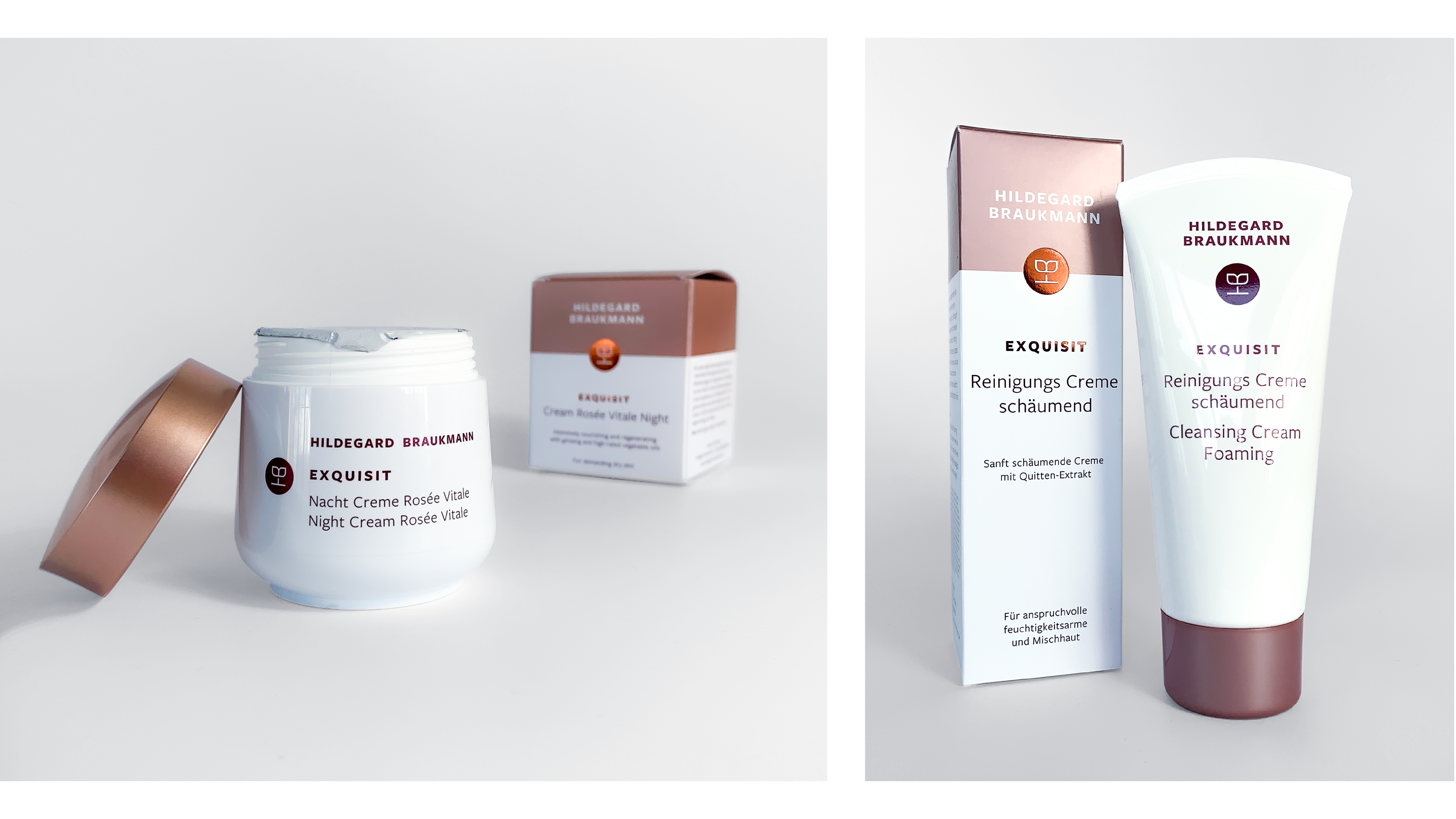
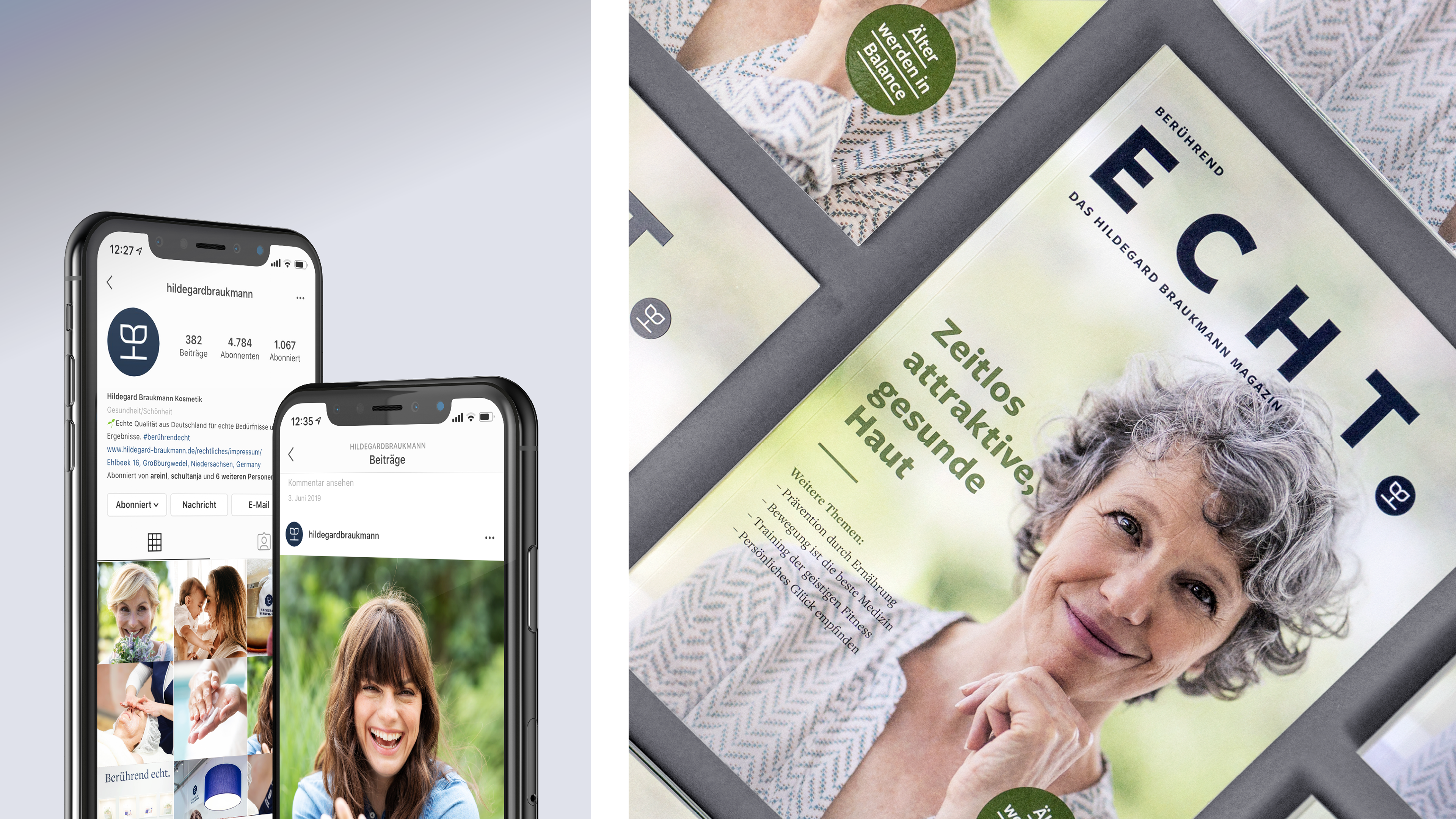
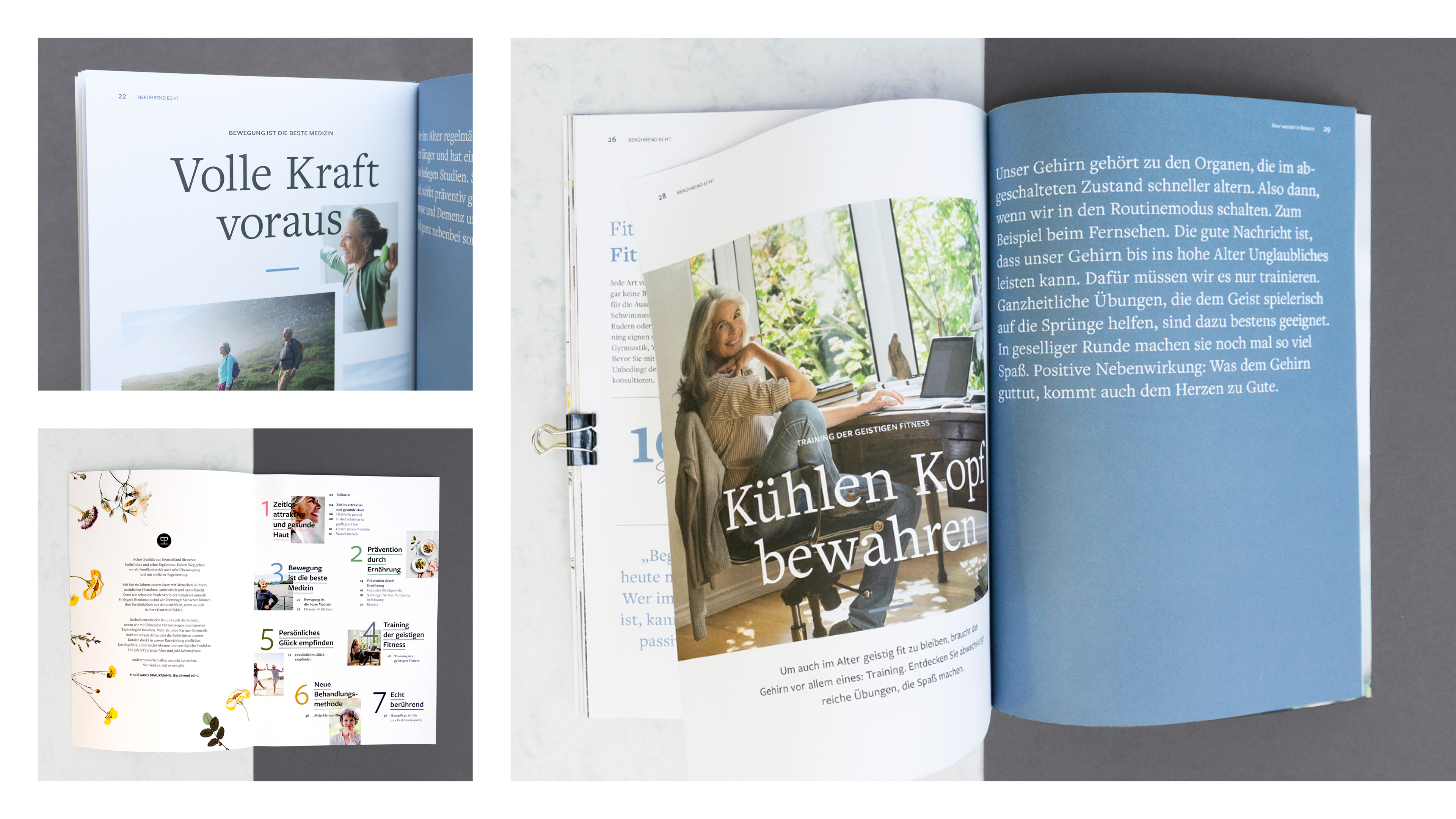
About time for a new Corporate Design, which makes the honest values of the company experienceable in an authentic, contemporary and emotional way. Out of the central idea "touchingly genuine", wirDesign developed a scalable design system, which convinces by its clear feel. Structured and at the same time appealing, the packaging design provides orientation in the exceptionally large variety of products. The trademark is the emotional anchor point: In the playful ligature, the familiar initials of the brand name merge into a new symbol of trust in the power of herbs and the growth that this makes possible.


Creative Direction: Brigida Kempf
Art Direction: Stefano Conzatti, Frederik Wilken
Design: Louisa Heimberg
UI/UX: Marcus Morczinietz
Text: Henrike Steiner
Desktop Publishing: Oriana Seidel
Account Management: Svenja Bartholl